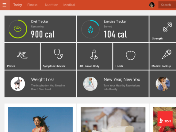
After the success of Bing for iPad, I was approached by Bing senior leadership to envision a set of apps for the upcoming Windows 8 operating system. Unlike Bing for iPad, which was a mothership app, the goal was to create several rich standalone apps for each of Bing’s verticals. The design concept became very influential and a new Microsoft division, Application Experiences (APPEX), was started to ship the apps for Windows 8. As a Senior Design Lead I, was responsible for the initial vision, and led the team working on the UX framework and feature design of the app suite.
Finance
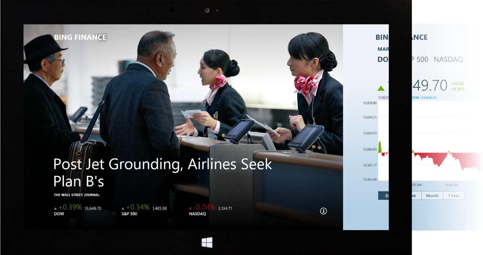
When we set out to design the Windows 8 Bing apps, we decided that content was going to be king. The apps would have less chrome and more content. The Finance homepage was no exception to that rule. Beautiful magazine-like imagery was the cover for our daily digital magazines.
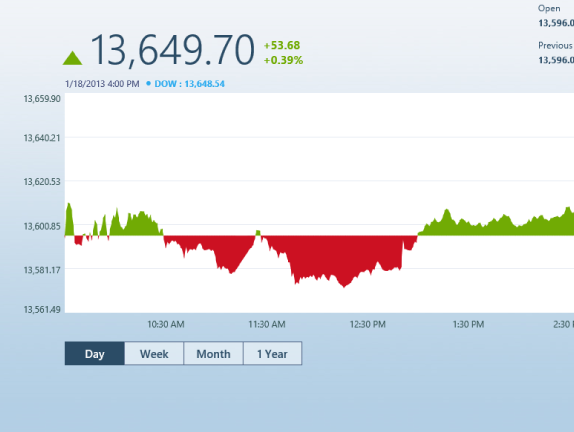
Finance - Chart
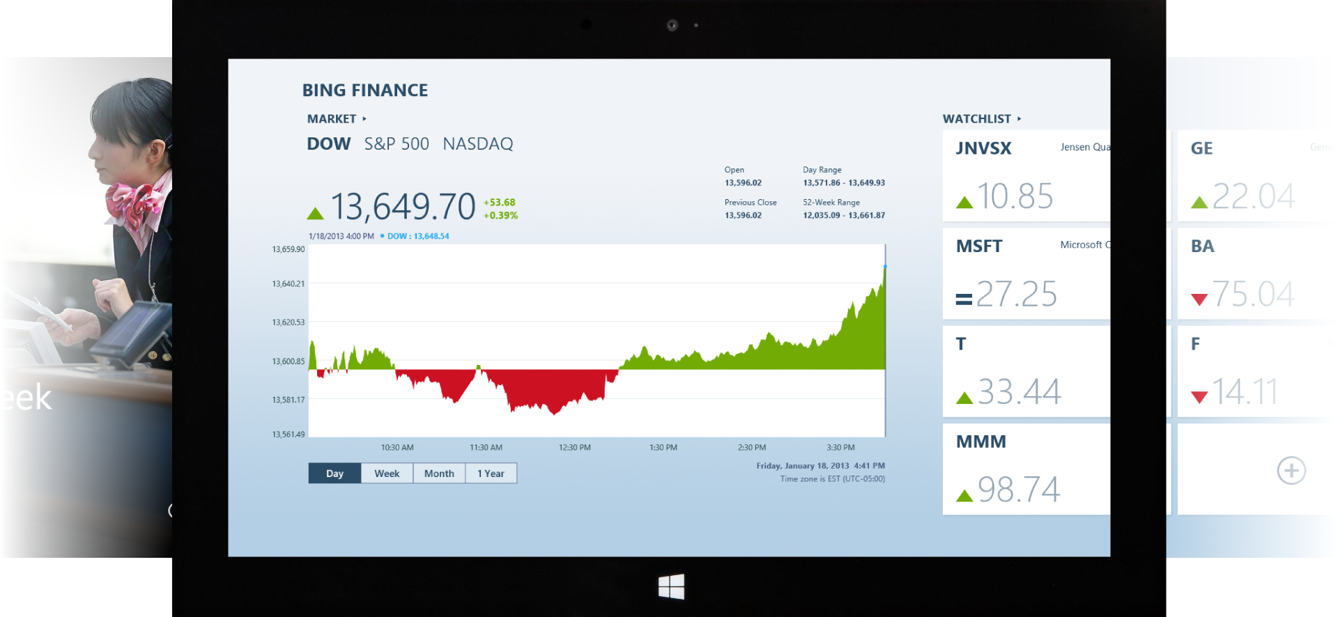
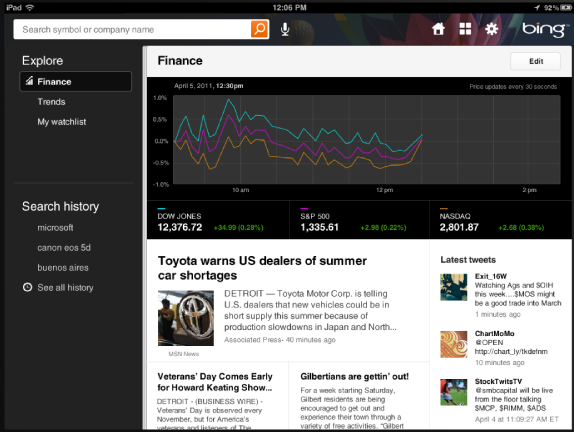
Imagery is not the only trait Bing is known for. Bing also has tons of raw data, so with a simple left swipe the user could view a compelling data visualization of the top markets.
Finance - World Markets
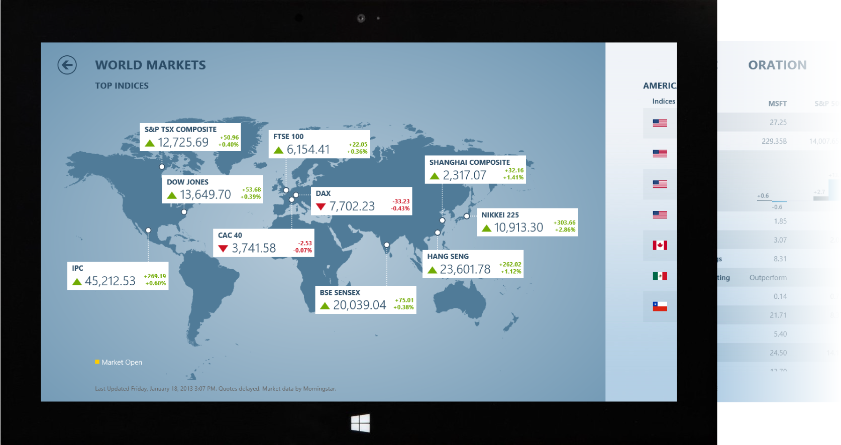
Since the app was bundled with Windows 8 our audience was huge, not only in the US but also international. The Finance app provided data from around the world and gave an international perspective to financial information.
Finance - Stock Details
Key statistics on the stock details page is another example of how Bing Finance used data visualization to enhance the user experience.
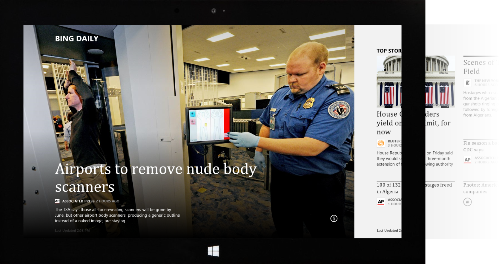
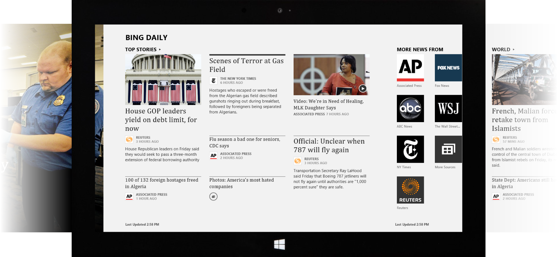
News
We used different typefaces throughout the app suite depending on the personality of the app. News used a professional serif font while sports used an impactful bold sans-serif.
News - Articles
Like several other Bing apps such as Bing for iPad and BingBar, news is a big part of the Bing experience. It includes some of the best sources in the world such as the New York Times and The Wall Street Journal. In the Windows 8 app we wanted to emulate a traditional newspaper layout to make the articles shine.
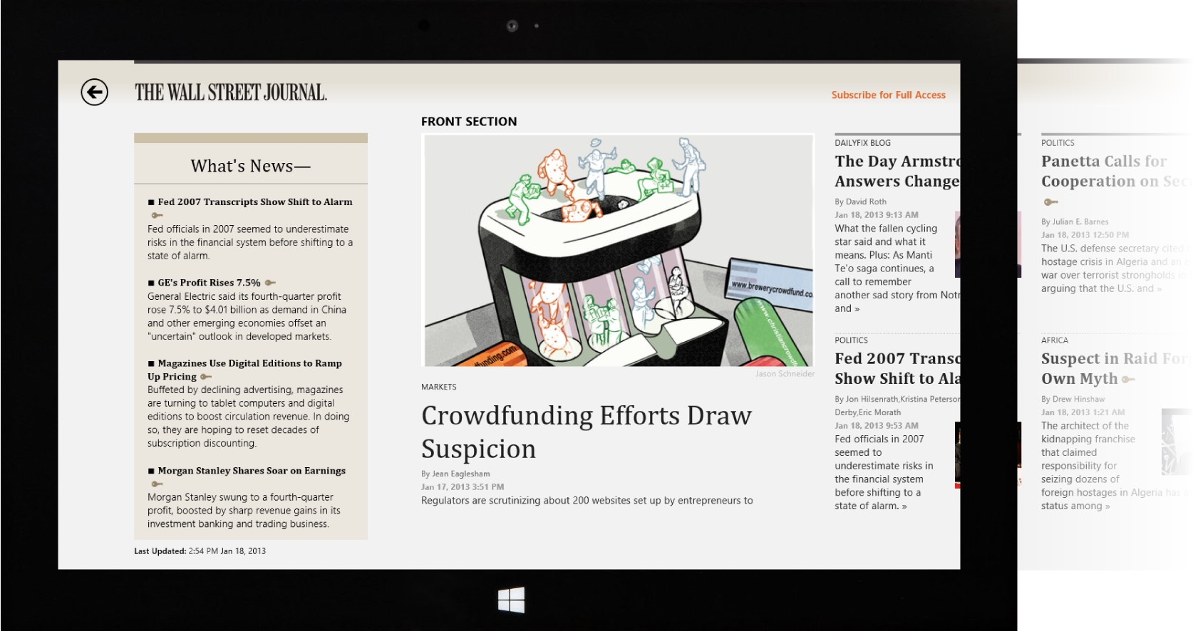
News - Partners
When displaying content from our partners, the News app went the extra mile to style the pages with visual elements native to the publication. In this Wall Street Journal example, we used their typeface, colors, and some of their visual decorations.
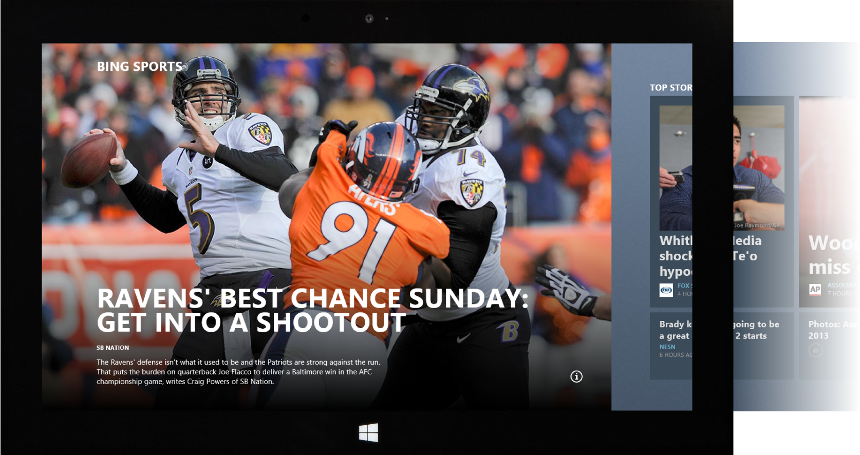
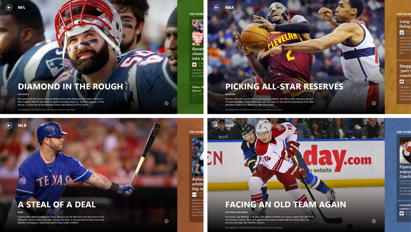
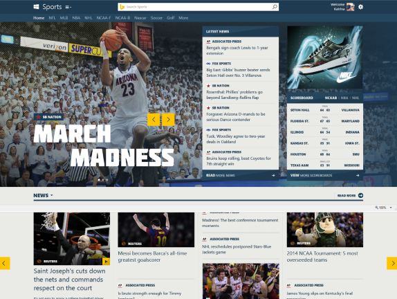
Sports
The Bing image of the day influence took on new life in the Sports app cover. We used rich beautiful imagery to create a sense of drama appropriate for sport stories.
Sports - Heroes
Every sport in the app had a different hero image coupled with colors and textures to match the sport’s environment: grass, court, dirt and ice.
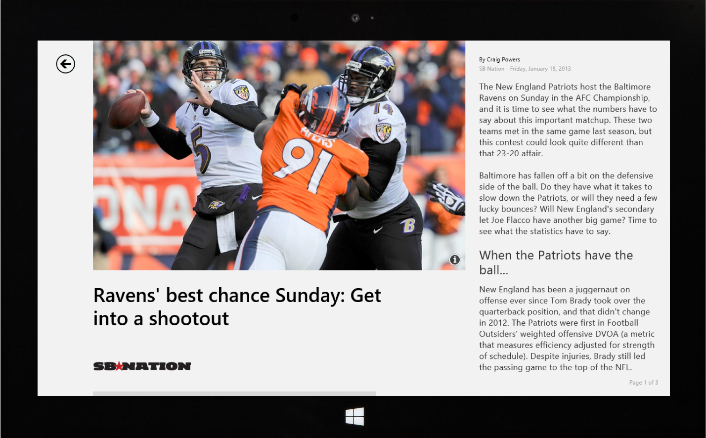
Sports - Article Reader
Throughout the Bing Windows 8 app suite, the article reader control was the centerpiece of the reading experience. We created an article reader with multiple templates to accommodate a variety of article types and content.
Sports - Players
Structured data reached a new dimension in the Sports app. Great headshots coupled with impactful typography made the player stats pop out of the screen.
Sports - Player Bio
In another example of how structured data was displayed on the Sports app, color is used to accentuate key statistics and the graphs make the data easy to understand and scan.
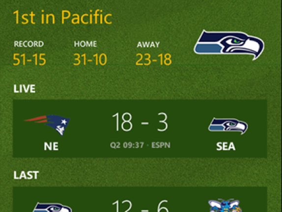
Sports - NBA
The Sports app was the app in the suite with the most data and statistics. We had to design several table layouts to accommodate the variety of sports data while always optimizing for legibility and clarity.
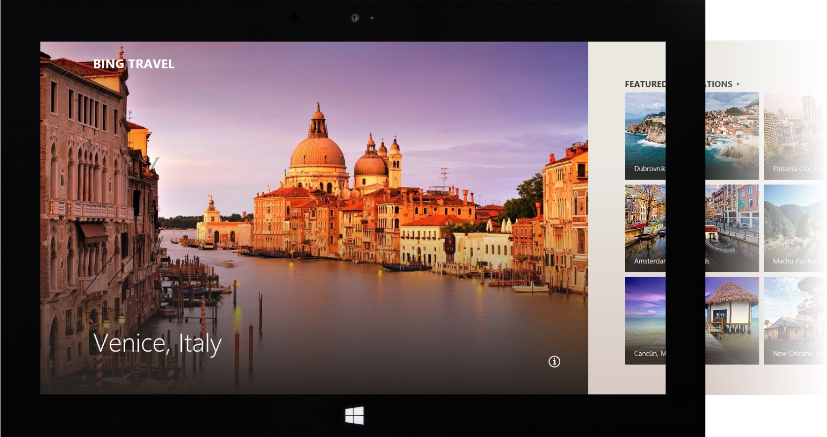
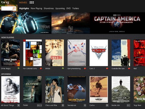
Travel
Beautiful imagery was sourced from top travel sites such as Frommer’s, Lonely Planet and Trip Advisor.
Travel - Destination
The goal of the Travel app was to provide users with a travel guide to thousands of the world’s top destinations and show the best deals on flights and hotels.
Travel - Destination Details
When designing details pages across the whole suite we sought to provide our users with the best content on the web. Links to maps, guides, images and reviews made the Travel app very comprehensive.
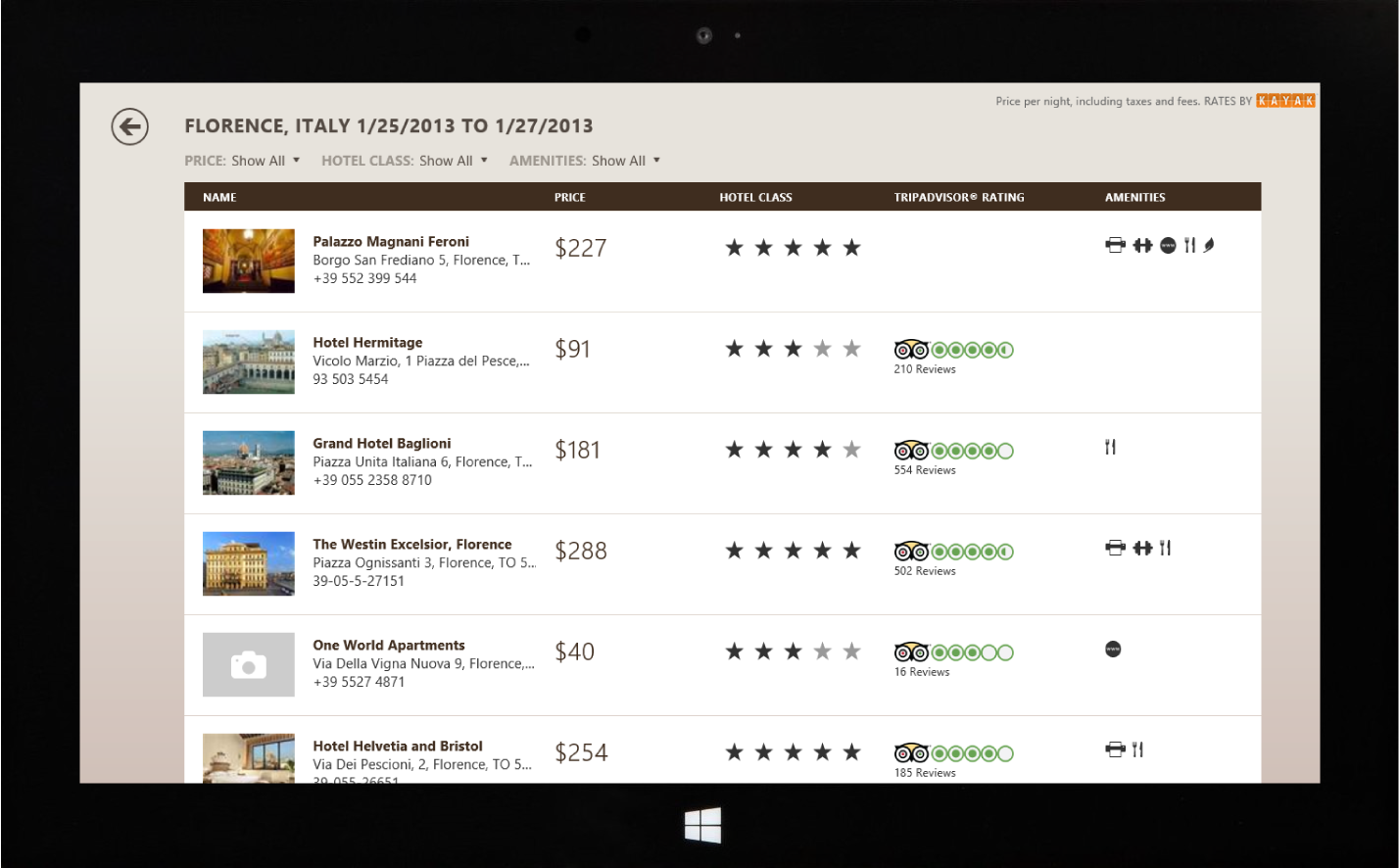
Travel - Hotel Search
Hotel search powered by Kayak allowed users to find the best deals on hotels across the globe. Visually, we tried to make sure the results always had the appropriate reading hierarchy. In this example, the price and the ratings make it easy to find the best deals with the highest ratings.
Travel - Flight Search
The flight search results (also powered by Kayak) used an expandable drawer which displayed flight details such as: long layovers, redeyes, and time zone shifts. Using color and type helped us underscore actions and alerts.
Weather
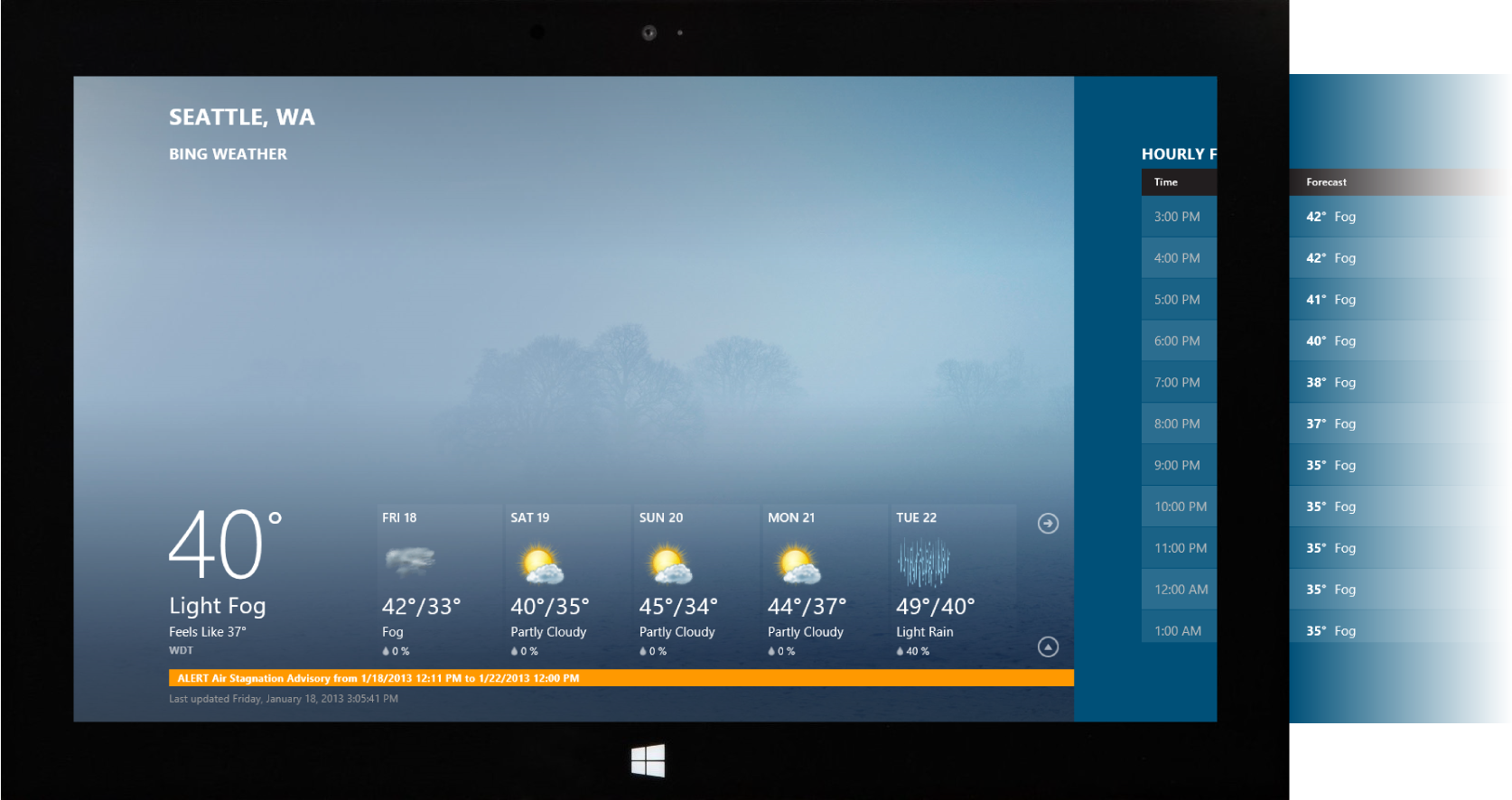
Ambient imagery that was first used on the BingBar was taken to new level by making it the hero. Here the app chrome becomes invisible and the user can be immersed on weather content.
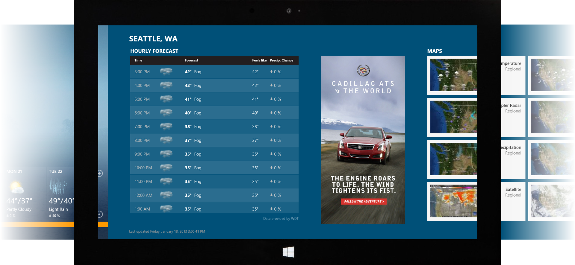
Weather - Hourly Forecast
The color theme of the app matched the weather condition. Even though the Weather app was number heavy, the changing ambient pictures and color themes made it feel dynamic and visually impactful.
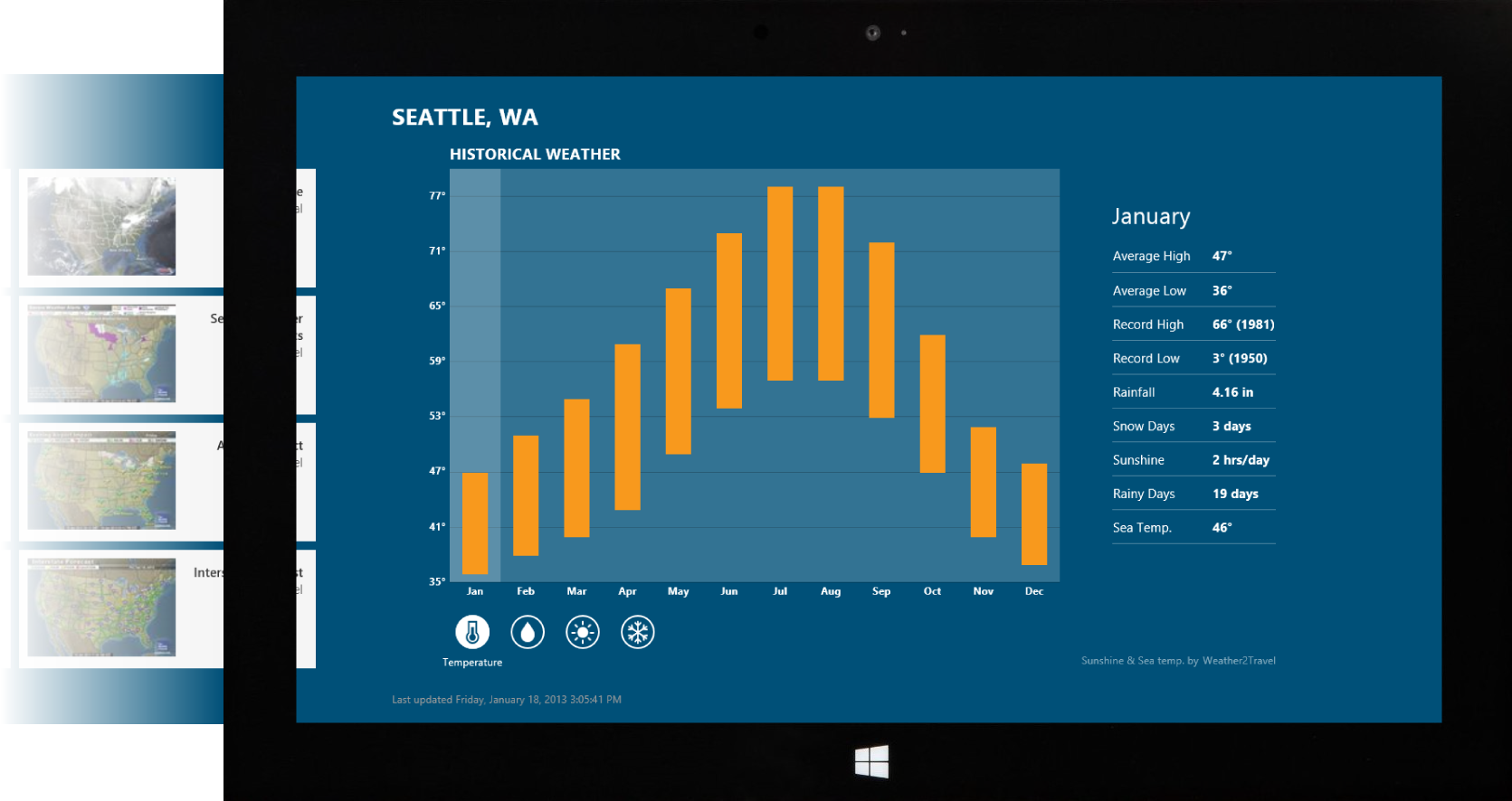
Weather - Historical Weather
Data visualization can also be interactive. In the weather app, we used interactive graphs to display historical weather data for temperature, rainfall, sunshine and snow.
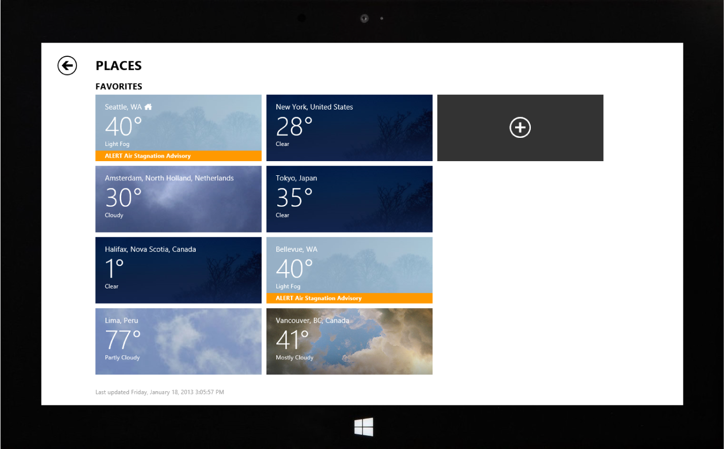
Weather - Favorites
With one glance, the user can view the weather across multiple of their favorite cities.
Design contributors: Rodney Edwards, Tony Lew, Christina Koehn, Dong Yoon Park, Eric Sexauer, Emily Voreis, Ping Li, Vaibhav Jain, Yash Misra, Sooyun Yun